Goal Setting is Often an Act of Desperation, Part IV
Note: This is the final installment of a four-part series on organizational goal-setting.
For the past four months, I’ve been writing about organizational goal-setting. In Part I of the series, I proposed four conditions that organizations should understand prior to setting a goal. In Part II, I introduced the idea of “arbitrary and capricious” education goals as well as the first five of my 10 Key Lessons for Data Analysis. In Part III I rounded out the lessons with an introduction to lessons 6-10. In this installment, we’ll take a look at an applied example of the lessons in action.

In order to bring the 10 Key Lessons for Data Analysis alive, I’m going to use a project completed by Jessica Cutler as a part of her participation in USN’s Continual Improvement Fellowship. The purpose of the fellowship is to learn tools, techniques, processes, philosophies, and theories related to the science of improvement, and then to apply this science to an actual problem. In Jessica’s case, she is attempting to improve the Joy in Learning of students in her 4th grade science class.
In order to illustrate the application of the lessons to an improvement project, I listed each lesson in bold text, provided a brief description of the lesson, and then explained how the lesson was applied in Jessica’s improvement project.
10 Key Lessons for Data Analysis Applied to an Improvement Project
Lesson #1: Data have no meaning apart from their context.
Description: Anyone looking at the data should be able to answer some basic questions such as: Who collected the data? How were the data collected? When were the data collected? Where were the data collected? What do these values represent? What is the operational definition of the concept being measured? How were the values of any computed data derived from the raw inputs? Have there been any changes made over time that impact the data set (i.e., change in the operational definition of the concept being measured, change in the formula being used to compute the data, etc.)?
Project Application: Early on in Jessica’s project, her and her students created a problem statement with the following desired future state: We are able to stay focused through science, enjoy science class, and remain engaged. The class then came up with an operational definition for Joy in Learning which was “to have fun learning, finding things we like to learn, and have fun completing classwork and activities.” After Jessica and her students had the operational definition of joy in science, she then designed a simple survey by which to collect student feedback several times each week. The first question on the survey was, “On a scale of 1-10 how much did you ENJOY science class today?” The second question, “What made you enjoy/not enjoy class today?”, was open-ended.
Lesson #2: We don’t manage or control the data; the data is the Voice of the Process.
Description: However, we do manage the system and processes from which the data come. A key conception of the systems view of organizations is that improvement efforts require someone from the outside that has Profound Knowledge collaborating with the people working in the system (i.e., students) and the managers that have the authority to work on the system (i.e., teachers, school leaders). If we wish to make breakthrough improvements in our schools and school systems, we must make time to work on the system of learning and to continually improve it with the help of our students. The System of Profound Knowledge provides the theoretical foundation for the transformation of conventional classrooms to those guided by quality learning principles.
Project Application: Students as well as someone from outside the system with Profound Knowledge (or someone internally that taps into outside knowledge gained through the System of Profound Knowledge) are the substantially underutilized secret weapons of continual improvement efforts in schools. School and district-based improvement teams are typically devoid of both. Students working in the system can help identify the waste and inefficiency in the system. They must be paired with teachers and principals that have technical knowledge and the authority to change the system. Both must be guided by someone from outside the system with an understanding of the System of Profound Knowledge. In Jessica’s project, she served as the subject-matter expert with the authority to change her science class. I served as a resource with expertise in the System of Profound Knowledge. Students from her science class were the third component of the improvement team that helped identify obstacles to their Joy in Learning.
Lesson #3: Plot the dots for any data that occurs in time order.
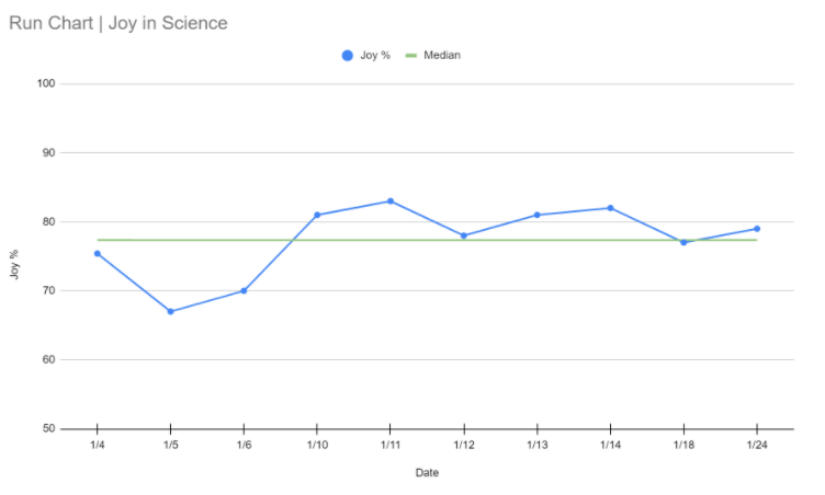
Description: The hashtag plot the dots (#plotthedots) was developed by the improvement team at the National Health Service in England. The primary point of ‘plot the dots’ is that plotting data over time helps us understand variation and leads us to take more appropriate action. As Dr. Donald Berwick put it, “Plotting measurements over time turns out, in my view, to be one of the most powerful things we have for systemic learning.” Plotting data on a run chart and connecting consecutive data points with a line makes analysis far more intuitive than data in a table. The run chart serves as the foundation for plotting the dots on a process behavior chart once you have enough data to do so. The bottom line is that both run charts and process behavior charts will always tell us more than a list or table of numbers.
Project Application: As Jessica started to administer the Joy in Learning survey, she immediately began “plotting the dots” on a run chart. The run chart below helped her to see variation in the survey data over time and was eventually converted into a process behavior chart (see Lesson #5).
Lesson #4: Two or three data points are not a trend.
Description: The plotting of dots should occur as soon as you have decided to collect some set of data which occurs over time. This encompasses almost all data we are interested in improving in schools. Many of us will have relied on comparing two points from consecutive weeks, months, or years. However, the problem with looking at just two or three points of data is that it tells you nothing about trends nor anything regarding how much the data varies naturally.
Project Application: The run chart above has data from the first 10 surveys Jessica administered to her 4th grade science class. Even with only 10 data points plotted over time, we are beginning to learn a lot about the Joy in Learning concept, and we’re certainly learning much more than we would with just 2-3 points or even with 10 points stored in a spreadsheet.
Lesson #5: Show enough data in your baseline to illustrate the previous level of variation.
Description: A run chart can be converted into a process behavior chart once we have enough data to construct the natural process limits. In practice, limits based upon an average moving range will begin to solidify when 17 or more values are used in the computation of those limits (when using the median moving range solidification begins when 23 or more values are used in the computation). But we often must work with fewer data points in real life, and useful limits can be computed with as few as five or six values.
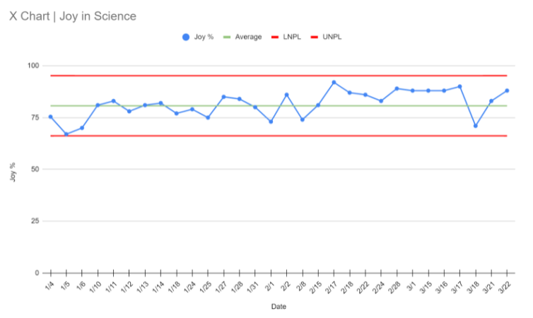
Project Application: Jessica continued to collect data from the Joy in Learning survey through February and March. At the point we had 10 data points I created a process behavior chart with upper and lower limits, and then we collected an additional 14 points to include in our baseline data. The process behavior chart is below.
Lesson #6: The goal of data analysis in schools is not just to look at past results, but also and perhaps more importantly, to look forward and predict what is likely to occur in the future.
Description: Process behavior charts provide a better approach to the interpretation of data because they take the effects of variation on the data into account. These charts allow us to classify variation as either routine (common cause variation) or exceptional (special cause variation) and in turn allow us to focus on the behavior of the underlying system that produced the results. This focus on the system and its processes is the basis for working towards continual improvement.
Project Application: As of March 22nd, Jessica and her students have collected 30 Joy in Learning data points. The Lower Natural Process Limit is 66%, the Upper Natural Process Limit is 95%, and the average is 81%. This means that if nothing changes within Jessica’s 4th grade science system, we can expect the data to bounce around the 81% average and stay within the bounds of the limits. We do see one signal in her data, which is a run of nine points between February 17th and March 16th. However, I chose not to shift the limits at this point even though we did have a signal because there is nothing we can point to that was a change that we made to the system that would bring about this shift. Besides that signal, we only see common cause variation present.
Lesson #7: The improvement approach depends on the stability of the system under study.
Description: A system that is producing predictable results is performing as consistently as it is capable. It is a waste of time to explain noise (common cause variation) in a stable system because there is no simple, single root cause for noise. Instead, if the results are unsatisfactory the appropriate focus is working on improvements and changes to the system. Allow me to say this another way: we can improve a common cause process or system by working on the design of the system, including the inputs and throughputs that are a part of it. In contrast, in an unpredictable system that displays special causes, it is a waste of time to attempt to improve or change the system until it is stable again. In this type of system, you must investigate and try to identify what caused the data points to be different. Then, you want to study and remove the special causes affecting the system to return it to a stable, predictable state. The inability to recognize these two different improvement roadmaps is the source of tremendous confusion and wasted effort in the education sector.
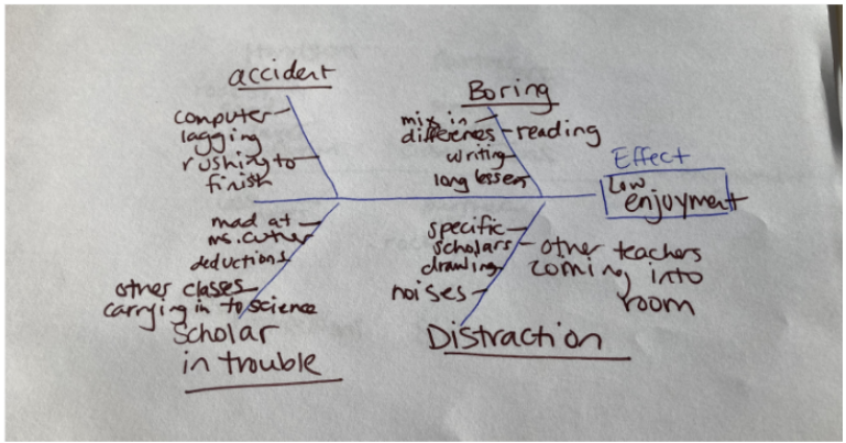
Project Application: The 4th grade Joy in Science data indicate that this is a predictable, stable system. This means that the way to improve is to work on improvements and changes to the system itself. There are no special causes to study and remove, but the team wasn’t happy with the 81% Joy in Learning average. The class used a fishbone diagram to map the obstacles to enjoyment (see below), and then within those causes the students identified distracting noises as a dominant cause of low enjoyment during science.
Lesson #8: More timely data is better for improvement purposes.
Description: State testing data isn’t very useful for improvement purposes because it is only available once per year and results often arrive after students have gone on summer vacation. It is better to have more frequent data, so we can understand if an intervention is having its intended effect. Most importantly, the frequency of data collection needs to be in sync with the improvement context, and no matter the frequency of collection, we shouldn’t overreact to any single data point. Ultimately, the data allows us to understand the variation and trends within our system, whether our system is stable or unstable, and what type of improvement effort would be most effective.
Project Application: Jessica collected 30 data points between January 4th and March 22nd which works out to 2-3 data points for most of the weeks during that period. Most importantly, her and her students were not overreacting to any single data point, but rather worked to understand the variation and trends within the 4th grade science system.
Lesson #9: Clearly label the start date for an intervention directly in the chart.
Description: A change idea or intervention should be clearly marked in your process behavior chart. This can be done by inserting a dashed vertical line on the date the intervention is started and should include a simple label that captures the essence of the intervention. This allows the team to easily see the data prior to and after the implementation of the change idea. The three rules for finding signals can then be used to see if the intervention is indeed bringing about the intended improvement.
Rule 1: Any data point outside of the limits.
Rule 2: Eight consecutive points on the same side of the central line.
Rule 3: Three out of four consecutive data points that are closer to the same limit than they are to the central line.
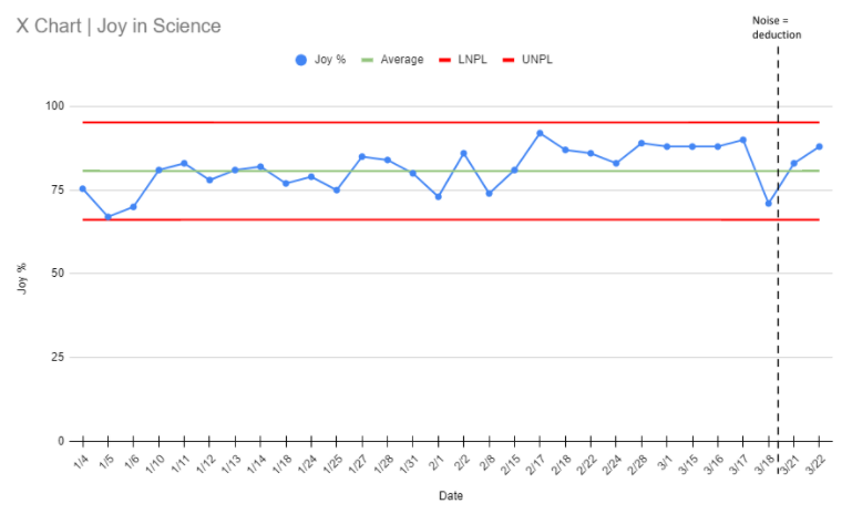
Project Application: Jessica and her class developed a change idea around reducing distracting noises during science class. Specifically, students said, “If we get automatic deductions for making noises, then there will be less noises.” Deductions are the equivalent of a demerit in the school’s management system, but the key point here is that students developed this idea, and as a result, will be much more likely to be invested in the system. Their basic premise is, “If there are less noises then we will be able to enjoy science class.” Keep in mind that all of this is being created by 9 and 10-year olds with guidance from their teacher! The class rolled out this change idea on March 19th as marked by the dashed line in the process behavior chart below.
Lesson #10: The purpose of data analysis is insight.
Description: Dr. Wheeler taught us that the best analysis is the simplest analysis which provides the needed insight. Plotting the dots first on a run chart and then on a process behavior chart is the most straightforward method for understanding how our data is performing over time. This understanding is much more intuitive to comprehend than data stored in tables, and patterns in this data become much more apparent using time-sequenced charts.
Project Application: Now that the change is being implemented by Jessica and her students, she’ll continue to gather the Joy in Learning data to see if the team’s theory is correct. The prediction is that reducing noises during science will lead to more joy in the class. If their theory is effective, we should see signals to that effect in the coming weeks. If it is not, we’ll have learned this through a very low-stakes experiment, and we’ll then try another approach.
Improvement with Joy
Jessica’s project illustrates a very different approach to school improvement guided by sound continual improvement methods and the 10 Key Lessons for Data Analysis. Instead of setting an arbitrary improvement goal at the outset of the project, she and her 4th graders avoided this “act of desperation” and studied their system. Too often in our attempts to improve schools, we go fast, learn slowly, and fail to appreciate what it actually takes to make some promising idea work in practice. Left in the never-ending wake of good intentions are teachers with initiative fatigue. However, Jessica and her 4th graders demonstrate that there is a better way to work towards improvement. And, the best part is, these methods make it much more likely that students will find joy in their learning and educators joy in their work.
***
John A. Dues is the Chief Learning Officer for United Schools Network, a nonprofit charter management organization that supports four public charter schools in Columbus, Ohio. Send feedback to jdues@unitedschoolsnetwork.org.