Getting Better: Filtering Out the Noise

Note: The School Performance Institute’s Learning to Improve blog series typically discusses issues related to building the capacity to do improvement science in schools while working on an important problem of practice. Now, however, we’re sharing how the United Schools Network, a nonprofit charter management organization based in Columbus, Ohio, is responding to the Covid-19 pandemic and planning educational services for our students during school closures.
As schools consider how to restart in the fall, some are galvanizing their community to consider this an opportunity for reinvention, a way to rethink how we educate our young, while others simply want to get students back in the building and return as quickly and safely as possible to the normal that existed prior to the pandemic. Regardless of a school’s position on the spectrum from restart to reinvention, a more sophisticated manner in which to analyze student engagement and track efforts to improve engagement will be necessary.
In prior blog posts, my colleague John A. Dues explored the idea that successful remote learning requires a whole new system, especially because many teachers were accustomed to in-person teaching and had no prior experience with teaching students from afar through a computer. I followed up with some thoughts on defining student engagement by creating operational definitions for key remote learning concepts (like engagement) and then using those definitions to inform data gathering. Finally, John discussed the use of Process Behavior Charts (PBCs) to better understand and analyze student engagement data, and how to use a basic knowledge of variation to avoid common pitfalls of under- and overreaction to these data. Let’s pick up the conversation there.
Inspired by the legendary management consultant W. Edwards Deming and the esteemed statistician Dr. Donald J. Wheeler, Mark Graban, in his book Measures of Success, proposes three key questions that organizations must consider when using data to drive improvement:
Are we achieving our target or goal?
Are we doing so occasionally?
Are we doing so consistently?
Are we improving?
Can we predict future performance?
How do we know we are improving?
When do we react?
When do we step back and improve?
How do we prove we’ve improved?
The engagement data we collected from Columbus Collegiate Academy-Main Street during the first two weeks of remote learning is displayed in the table below. Our operational definition for engagement is: “A USN middle school student demonstrates engagement in a remote lesson by completing the accompanying practice set in its entirety.”

Let’s apply Graban’s key questions to the data table.
Are we achieving our target or goal? We set our target as 70 percent engagement, considering we were beginning a brand new system of instruction and faced significant barriers to successful implementation (internet connection, access to devices, etc.). It appears that we are hitting 70 percent engagement in some classes on some days.
Are we doing so occasionally? Yes.
Are we doing so consistently? It is hard to tell from the data. While the color-coding draws attention to specific numbers, it is hard to tease out patterns in the data presented in this way. In addition, the color-coding, which corresponds to our grading scale, does not easily communicate achievement of our target (70 percent is still in the “yellow”).
Are we improving? It is hard to tell from the data. The simple list of numbers makes it difficult to identify patterns.
Can we predict future performance? Not from the data presented in this manner.
How do we know we are improving? We do not know if we are improving.
When do we react? We cannot know by presenting the data in this way.
When do we step back and improve? We cannot tell by presenting the data in this way.
How do we prove we’ve improved? We cannot prove we’ve improved by presenting the data in this way.
The table above is a start, and certainly better than not collecting and examining the data at all. The colors allow you to quickly obtain a very broad picture of remote learning engagement. More green is good, more orange/red is bad. However, the data, as presented in this way, cannot speak to improvement. A Process Behavior Chart (PBC) is a better option.
The PBC below takes data in a table and, by “plotting the dots,” allows you to see change over time in a more efficient manner—like a run chart on steroids. While the details on creating PBCs are beyond the scope of this blog post, I’ll quickly review what we see below.
The red lines are the upper and lower limits. You should expect engagement percentages to fall within these limits based on the data set. The green line is the mean (or average), and the blue dots are the engagement percentages for the given day. This PBC, for eighth grade math specifically, is telling us that we can expect remote learning engagement to fall between 47 and 85 percent on any given day, with a mean engagement rate of 66 percent.
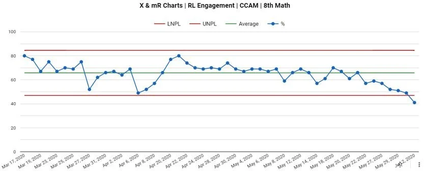
Graban proposes ten key points when utilizing PBCs to make data-driven decisions. Most importantly, he states that we manage the process that leads to the data we see above, not the data points themselves. We can spend hours blaming people for metrics we do not like, but that time is largely wasted. In the context above, the “voice of the process” is telling us that, if we don’t do a single thing to change the system, we can expect similar results moving forward—daily engagement between 47 and 85 percent. If we do not like the limits or the mean, we need to go to work on the process. Furthermore, we must understand the basic reality that variation exists in every data set; if we react to every “up and down” (called “noise”), we will likely burn out and miss actual signals in the data that we can use to improve. Why did engagement increase 8 percent from March 19 to March 20? Who knows? This is likely unknowable, and not worth further exploration. So when do we react?
In order to better analyze the PBC above, let’s apply Graban’s three rules:
● Rule 1 Signal: any data point outside of the limits
● Rule 2 Signal: 8 consecutive points on the same side of the mean
● Rule 3 Signal: 3 out of 4 consecutive data points closer to the same limit than the mean
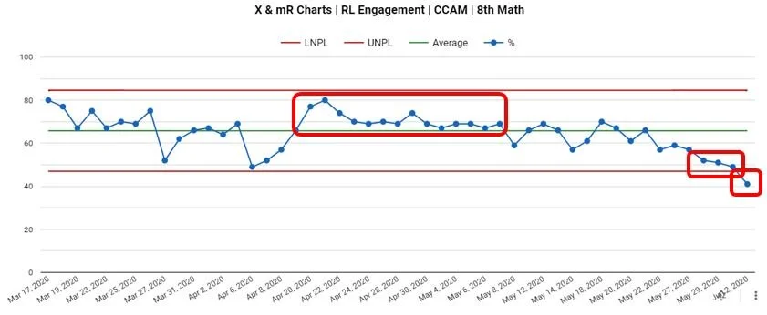
As demonstrated above, we see one example of each rule in our 8th grade math remote learning PBC. We can use this learning to modify the PBC to make it easier to determine next steps on the path to improvement.
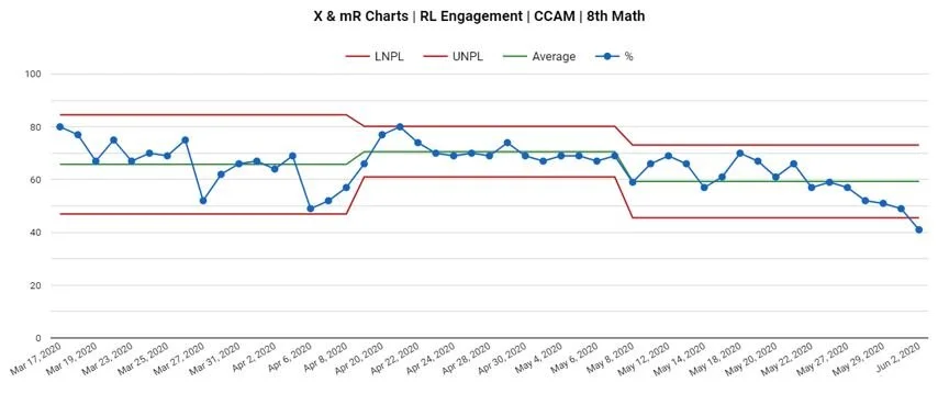
Below, after recognizing the “run of 8” that indicated engagement was increasing for a sustained amount of time, we adjusted the limits and mean for that specific chunk of time. Interestingly, the start of this improved period aligned with our return from spring break. We then adjusted the limits and mean after a sustained period of improvement when we detected a downward turn. Thus, a PBC that began as a singular, predictable system with wide limits has been redefined to a system with three distinct periods of varying engagement. An initial stage of highly-variable engagement (which makes sense, considering remote learning was brand new to everybody) gave way to a period of increased engagement (possibly due to students and teachers becoming accustomed to the new reality), and finally a period of decline as we approached the end of the school year.
One can imagine how schools could utilize PBCs to make more informed decisions on interventions, either proactively or retroactively. At USN, like many schools, we had to adjust to remote learning extremely quickly, and therefore did not have the time or bandwidth to track interventions with as much sophistication as we would’ve liked. However, let’s simulate how we could utilize PBCs moving forward, especially in light of the fact that remote learning, in some form, may continue into next year.

Eighth grade math experienced two significant shifts this spring in the remote learning context. Looking backward, with the goal of improving remote learning next year, we could ask ourselves: What was different between April 20 and May 7? Was the teacher texting students daily to remind them to complete assignments? Did we improve the way in which instructional materials were organized in Google Classroom to make it easier for students to find and complete them? Along the same lines, we see another unique system between May 8 and the end of the school year. What about our system changed that led to decreased engagement? At times, these questions may be difficult to answer, but when we detect a signal (remember the three rules above), it’s time to grab our shovels and dig.
This approach works proactively, as well. For example, we can pretend that today’s date is April 8, and we’re planning an intervention such as eighth grade teachers will text every student every day to remind them to complete their remote assignments. We collect daily data, and post-intervention, we note increased engagement. We now have data to demonstrate that this intervention shows promise! Conversely, pretend that today’s date is May 8, and we’re planning another intervention to try to increase engagement even more. We might ask eighth grade teachers to plan twice-weekly Google Hangouts to provide support to students who sign on. We collect the data for a few weeks and, unfortunately, the intervention does not lead to improvement. Moreover, average engagement decreased. While that’s a bummer, we still learned something. Above all, it’s vital to note that the focus is on the process—the changes we introduce to the system to improve it—not the people.
As a final step, let’s revisit our three key questions once more using the PBC instead of the table of numbers.
Are we achieving our target or goal? As a reminder, we set our target as 70 percent engagement. On average, we are not achieving our goal in the subject of math, with the exception of a two-week period following spring break.
Are we doing so occasionally? Yes.
Are we doing so consistently? No.
Are we improving? We are not improving. We experienced a period of improvement following spring break, but that was followed by a period of decline toward the end of the school year.
Can we predict future performance? We currently have a stable system with the exception of one signal on the last day of school. We can predict that engagement will vary between 45 percent and 73 percent, with a mean of 59 percent, unless something substantial shifts in our system.
How do we know we are improving? We can apply Rules 1, 2, and 3 to the PBC to separate signals from noise and determine if, and when, improvement occurs.
When do we react? We can react after we see a “run of 8” in the data, signaling an improvement in the system. We also reacted upon examining a Rule 2 later on that signaled a decline in engagement.
When do we step back and improve? After a period of improvement in mid-April to early May, we ended the year with a period of decline. We can use this learning to think about designing a better remote learning system next school year.
How do we prove we’ve improved? In this particular data set, we can prove we improved for a period in mid-April to early May as indicated by an increase in the mean engagement.
At SPI, we have much to learn about using PBCs in the field of education. However, we believe there is tremendous power in examining and acting on data in this way. We spend less time overreacting to (or underreacting to) common day-to-day variation, and more time improving the system and verifying the outcomes of interventions. Whether remote or in person, this type of data analysis will certainly help guide us in making smart decisions during an uncertain time.
***
Ben Pacht is the Director of Improvement of the School Performance Institute. The School Performance Institute is the learning and improvement arm of the United Schools Network, a nonprofit charter-management organization that supports four public charter schools in Columbus, Ohio. Send feedback to bpacht@unitedschoolsnetwork.org.