Data Ponds & Streams
Note: This is the third of a five-part series on understanding the concept of variation. Knowledge about variation is one of the components of W. Edwards Deming’s System of Profound Knowledge and is fundamental to correctly interpreting data.
Last month, I outlined why data has no meaning apart from their context. The discussion centered on some key ideas for presenting data in context as well as a logical definition of improvement. I also introduced an example of how data is often misinterpreted in the education sector. In this post, I’ll begin to lay the foundation for understanding variation in quality improvement work; this will be a precursor to comprehending why so much of the data analysis that is done in organizations is akin to writing fiction.

Quality & Variation Defined
Let’s begin by defining quality and quality improvement in addition to the two types of variation. When we say we are striving for quality outcomes in schools what we are really saying is that we are striving for minimal variation around some target or optimum value. Quality improvement work then is the idea of reducing variation around that target. It is also important here to differentiate between the two types of variation. There is common cause variation which are causes of variation that are inherent in a process over time. They affect every outcome of the process and everyone working in the process. There is also special cause variation which is the name for the source of variation in a process that is not due to chance and therefore can be identified and eliminated.
The key to quality improvement is being able to differentiate between common and special cause variation within a process that is important to us. Unfortunately, this is quite difficult. The human brain tends to default to an assumption that there is a single, specific, and often readily observable reason why results vary. This is almost never the case and results in the misinterpretation of data along two fronts - what Deming called Mistake 1 and Mistake 2. Mistake 1 occurs when we react to an outcome as if it came from a special cause, when actually it came from common causes of variation. Deming referred to this as tampering with the system. Tampering is action taken to compensate for variation within the control limits of a stable system; tampering increases rather than decreases variation (i.e. an intervention worsens performance). Mistake 2 is the opposite. It occurs when you treat an outcome as if it came from common causes of variation, when actually it came from a special cause. This is akin to not studying a data aberration when you should.
Variation is the Enemy
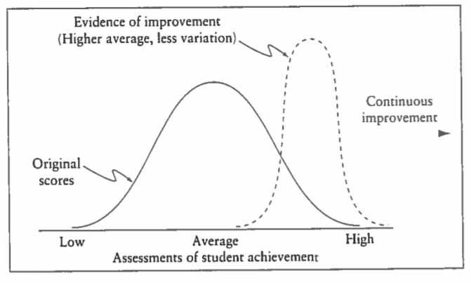
From the systems perspective, variation is the enemy because it means there is loss of performance within an important process. The wider the variation around our target, the lower the quality of our process. The tighter the variation around our target, the higher the quality of our process. This is shown in Figure 1, which is focused on some hypothetical assessment of student achievement. The aim of quality improvement work is to both increase the average of the assessment scores and to reduce the variation around that average. In the diagram, this improvement is illustrated by moving from the solid line distribution to the dashed line distribution on the right. However, without an understanding of variation and the ability to differentiate between common and special causes, leaders lack the ability to properly interpret data and in turn decide on a course of action that will lead to improvement.
Figure 1. Results of Quality Improvement of Teaching and Learning Processes (from The New Philosophy for K-12 Education, p. 60)
Process Behavior Charts
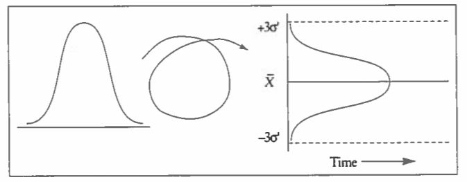
The first step in this process is to employ a statistical tool called a process behavior chart that allows for the differentiation between common and special cause variation. Process behavior charts turn the normal distribution on its side, extend the upper and lower limits (plus and minus three sigma) of controlled, common cause variation, and add the element of time. This is illustrated in Figure 2. Once we make this differentiation, we then have a better understanding for a course of action. If the source of variation on some key measure is only due to common cause variation, and if you're not happy with the outcome, the appropriate corrective action is to change the process. If on the other hand the outcome is due to special cause variation, then the appropriate corrective action is to identify and remove the special cause.
Figure 2. Foundation of the Process Behavior Chart (from The New Philosophy for K-12 Education, p. 129)
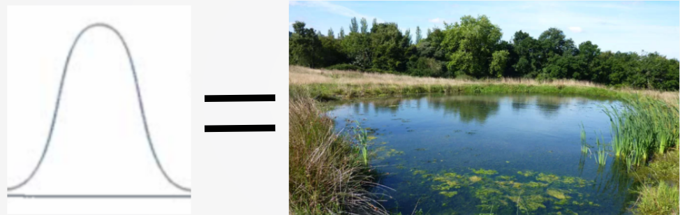
After viewing Figure 2 is a good time to circle back to the idea that I brought up in a February blog post that knowledge has temporal spread. The normal distribution on the left side of the diagram is a static snapshot of some piece of information from our system. It is analogous to taking a sample bucket of water from a pond where the pond is the total pool of data we are interested in. The water sample in the bucket has some set of characteristics that are displayed in that normal distribution, but they may not be very representative of that pond water sample a week, a month, or even a year later. Too often though, we are looking back at that original bucket of pond water weeks, months, or even years later as if it is helpful.
Figure 3. Normal Distribution as Pond Water Sample
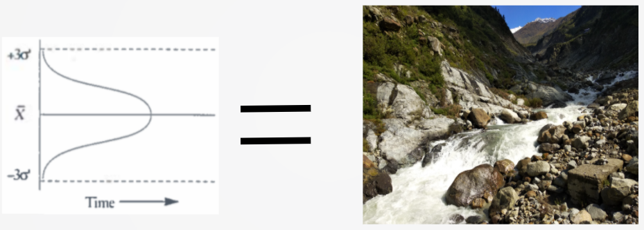
In order to change the pond water information into knowledge, we have to add the element of time to our understanding of the data. This could be academic, attendance, behavioral, enrollment, financial, or any other type of data we’re interested in in schools. This is part of the power of the process behavior chart. Seeing our data plotted over time allows us to begin to have knowledge about this data as opposed to non-helpful pieces of information (see Leadership & the Essential Elements of Transformation, Figures 1 & 2). The data that will be most helpful to us in schools does not sit still like pond water, but rather rushes at us like a mountain stream. The process behavior chart allows us to display the mountain stream as it rushes by, so that we have a continuous sample of the water as opposed to a point-in-time snapshot. This is the basic idea of knowledge having temporal spread as displayed in Figure 4.
Figure 4. Process Behavior Chart Captures Mountain Stream Water
Once we begin to plot our data over time and start to accumulate knowledge about how this data will perform, we can then begin to understand when to react to the data and as importantly when not to tamper (i.e. overreact) with the data. This will be the focus of Part IV in the series.
***
John A. Dues is the Chief Learning Officer for United Schools Network, a nonprofit charter-management organization that supports four public charter schools in Columbus, Ohio. Send feedback to jdues@unitedschoolsnetwork.org.