Variation is the enemy
Note: This is Part III in a five-part series on Deming’s System of Profound Knowledge.
In my first two posts in this series, I discussed the influence W. Edwards Deming has had on my continual improvement work and described systems thinking. In this post, I’m taking a deep dive into another component of Deming’s System of Profound Knowledge - Knowledge about Variation.
In the last written work of his long life, The New Economics, Deming had this to say about variation:
Variation there will always be, between people, in output, in service, in product. What is the variation trying to tell us about a process and about the people that work in it?
The main point that Deming was making was that outcomes are either good or bad by the time we look at them. The enemy is variation and the sources of variation in and around the process that produced the outcome. When you combine this point with the core idea of systems thinking - that most results belong to the system - you begin to see your organization through a completely new lens.

Two Types of Variation
Before diving into the Theory of Variation, it will be helpful to ground yourself in the definitions of quality, quality improvement, and two types of variation. When we say we are striving for quality outcomes what we are really saying is that we are striving for minimal variation around some target or optimum value. Quality improvement work then is the idea of reducing variation around that target. It is also important here to differentiate between the two types of variation. There is common cause variation which are causes of variation that are inherent in a process over time. They affect every outcome of the process and everyone working in the process. There is also special cause variation which is a name for the source of variation in a process that is not due to chance and therefore can be identified and eliminated.
The key to quality improvement is being able to differentiate between common and special cause variation within a process that is important to us. Unfortunately, this is quite difficult. The human brain tends to default to an assumption that there is a single, specific, and often readily observable reason why results vary. This is almost never the case and results in the misinterpretation of data along two fronts - what Deming called Mistake 1 and Mistake 2. Mistake 1 occurs when we react to an outcome as if it came from a special cause, when actually it came from common causes of variation. Deming referred to this as tampering with the system. Tampering is action taken to compensate for variation within the control limits of a stable system; tampering increases rather than decreases variation. Mistake 2 is the opposite. It occurs when you treat an outcome as if it came from common causes of variation, when actually it came from a special cause. This is akin to not reacting to a data aberration when you should.
Theory of Variation
From the systems perspective, variation is the enemy because it means there is loss of performance within an important process. The wider the variation around our target, the lower the quality of our process. The tighter the variation around our target, the higher the quality of our process. Without an understanding of variation and the ability to differentiate between common and special causes of this variation, leaders lack the ability to properly interpret data and in turn decide on a course of action that will lead to quality improvement.
The first step in this process is to employ a statistical tool called a process behavior chart that allows for this differentiation between common and special cause variation. Process behavior charts turn the normal distribution on its side, extend the upper and lower limits (plus and minus three sigma) of controlled, common cause variation, and add the element of time. Once we make this differentiation, we then have a better understanding for a course of action. If the source of variation on some key measure is only due to common cause variation, and if you're not happy with the outcome, the appropriate corrective action is to change the process. If on the other hand, the outcome is due to special cause variation, then the appropriate corrective action is to identify and remove the special cause.
Variation in Action
I’ve found that it is really only possible to grasp the Theory of Variation through applied examples. Coupling this with the fact that educators across the country are thinking about how to engage students in remote learning, we’ll focus there. For the sake of this example, let’s use an actual data set from an 8th grade math class at United Schools Network and define a student as engaged when they fully complete the practice set that accompanies a daily lesson.
There are many schools that are not collecting this data systematically. In most other situations where data collection is happening, it is more than likely that as the school year kicked off, the 8th grade math teacher or perhaps an administrator started to organize the engagement data in some type of table like the one below. In Figure 1, I’ve listed the engagement rates in 8th grade math for the first 24 days of the school year (24 data points is the gold standard to establish a baseline).

If we are concerned about improving engagement levels, as most of us are, it is really difficult to look at the data table and answer some basic improvement questions. Are we achieving our target or goal? Are we improving? How do we improve?
Some educators more than likely took this data table a step further and color-coded performance (note that the values assigned to each color have been done so arbitrarily). I’ve found that as a sector we love to apply the stop light colors - “green is good (85%+), yellow is take notice (70-84.99%), red is bad (<70%)” - to our data. This group likely has a data table that looks something like Figure 2.
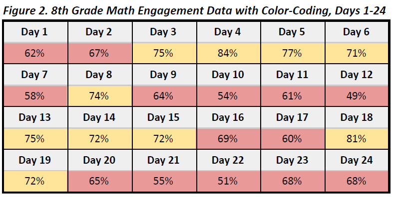
I don’t view Figure 2 as a better version of Figure 1. I actually think when you add the color-coded system you actually increase the likelihood of tampering such as when there is an overreaction to single data points based on the arbitrary scale. There are a couple of reasons for this. First, are the values that would be color-coded as “green” actually good enough? What if there was a day that you had 85% engagement? This means that 15% of the students in the 8th grade did not engage on that particular day. This has the potential to become a problem if the arbitrary goal of 85% becomes something to aspire to. A second issue is the inability to differentiate between meaningful differences in engagement levels. For example, on Day 15 the engagement rate was 72% and color-coded yellow. On the very next day it was 69% and coded red. An elementary student could tell me that 72% is 3% higher than 69%, but that information is virtually meaningless. What we really need to know is if the difference between Day 15 and Day 16 was statistically significant, and there is no way to answer this question using the table in Figure 2.
Let’s turn now to that same math engagement data displayed in a process behavior chart.
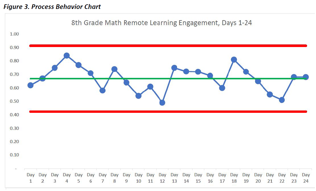
Even if you don’t know anything about process behavior charts, just seeing the data from the tables displayed in this way makes an analysis much more intuitive than viewing the data in the tables alone. These charts display what is occurring in your system; they represent the voice of the process. Each blue dot on the chart represents the engagement rate of the 8th graders during each day of remote learning. The green line represents the mean of this data from Day 1 through Day 24. The red lines are the upper and lower control limits that bound the system at three standard deviations. The control limits have nothing to do with goals or targets, but rather are calculated by using a simple formula. Based on the data collected so far you would expect the daily engagement rates to be between 42% and 91% in 8th grade math. When you combine the power of the process behavior chart tool with knowledge of variation, you can then start making better decisions regarding how and when to improve your data.
In looking at the eighth grade math engagement rates, we can learn a few important things. First, the data indicate a stable system because the plotted points for the first 24 days remain between the red control limits (there are other rules for interpreting the data, but those are beyond the scope of this article). This means that we can reasonably expect that the engagement levels for this eighth grade math class will produce similar results over time, and now that we have the data through the first third of the school year, that is mostly what we see. Second, in the first 24 days of remote learning, we don’t see any signals of special events in the data. One indicator of a signal would be a single point outside of the red control limits. This means that there haven’t been any significant events, either in a positive or a negative direction, to attend to in this eighth grade math remote learning system. Third, and most importantly, if we are not satisfied with the overall engagement levels in eighth grade math then we have to work together as a team on improving the system that is producing those results.
The idea of improving the system, and not the individuals working in the system, lies at the heart of Knowledge about Variation. I’ll give the final word to Peter Scholtes who wisely observed the following in his seminal work on this topic, The Leader’s Handbook:
The old adage, "If a student hasn't learned, the teacher hasn't taught" is not true or useful. Instead a much more useful characterization is, "if the learner hasn't learned, the system is not yet adequate."
***
John A. Dues is the Chief Learning Officer for United Schools Network, a nonprofit charter-management organization that supports four public charter schools in Columbus, Ohio. Send feedback to jdues@unitedschoolsnetwork.org.