Improvement Science Tool: Fishbone Diagram
Note: Here’s part six in our 2019-2020 Learning to Improve series which is the primary focus of the School Performance Institute (SPI) blog this year. In it, we spotlight issues related to building the capacity to do improvement science in schools while working on an important problem of practice.
Why are we getting the outcomes that we currently do? In my last post, I implored organizational leaders to slow down and take the time to deeply understand this question before moving ahead with solutions.
The only way to understand current outcomes is to step back and see the system - the people, the policies, the attitudes, and the physical environment - in which a problem resides. Improvement science is not as didactic as traditional research designs, so there is not a prescribed criteria that must be applied to every problem. However, the methodology does have a number of tools for its users to employ as they seek to better understand a problem and the system in which it lives. These tools can be used to perform a root cause analysis for systematically and logically exploring and categorizing the causes of a problem under study. One such tool is the Fishbone Diagram.
What is a Fishbone Diagram?
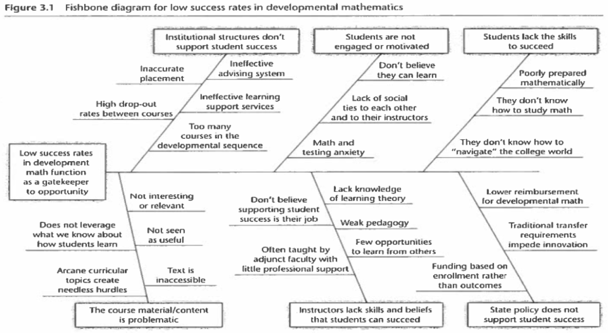
The cause and effect diagram (a.k.a Fishbone Diagram) was developed by Kaoru Ishikawa in 1943 to address quality control issues in steel manufacturing plants. The diagram originally bore the name of its founder, but as its use spread from Japan around the world it became better known as the Fishbone Diagram because the completed model looks like a fish head and bones.
The purpose of a Fishbone Diagram is to identify the causal factors for a problem. However, it is also a way for an improvement team to visualize and discuss those factors. It helps illustrate a problem by visually representing the details to show how they fit together within a system. A sample diagram from Learning to Improve is included below.
When to Use the Fishbone Diagram
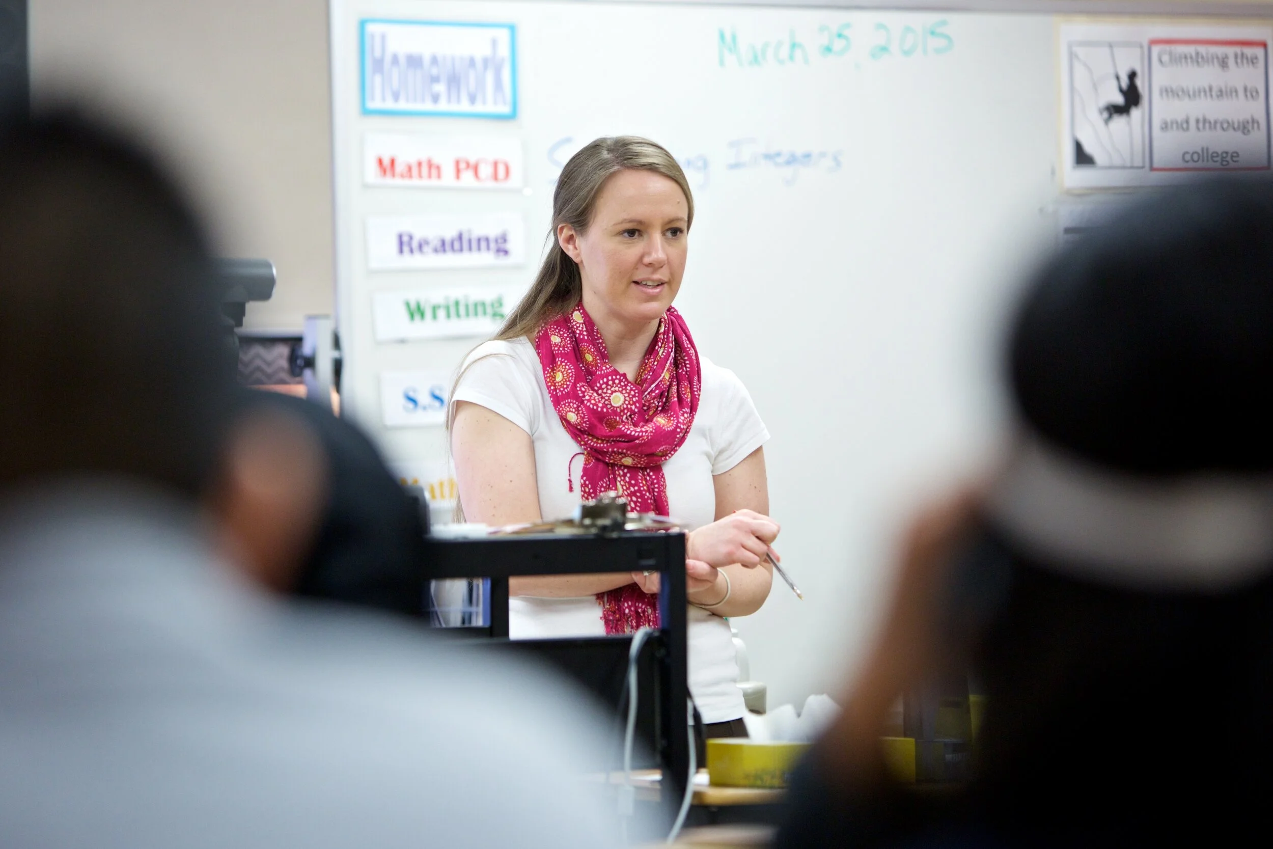
It may seem obvious, but you have to identify a problem - preferably a high-leverage, challenging, "wicked", equity-based problem - prior to diving into causal system analysis. For example, in our work with two Columbus middle schools, we are working to improve the high school readiness rates of their 8th graders. Before solutions were ever discussed, we first had to understand why so many of these middle school students were off-track for success in high school.
The Fishbone Diagram was a great tool to capture the experiences of each school’s leadership team because they knew the problem well. Additionally, we were working under time constraints. It typically takes only 60–90 minutes of meeting time to fishbone a problem and requires no outside expertise. So, in this case, it made sense to use the Fishbone tool. If there had been less problem-specific expertise among the leadership team members and more time for causal system analysis, another tool such as a Community Pulse survey or empathy interviews may have made more sense.
How to Create a Fishbone Diagram
When we facilitate the creation of a Fishbone Diagram with an improvement team, we take participants through a three step process: brainstorming, sharing, and refining. In the brainstorming phase, we have participants write all the causes they can think of that contribute to the problem on Post It notes. One specific idea is recorded on each Post It, and the initial brainstorming is done in silence to cut through the authority gradient. We make a point of making sure each idea is a cause of the problem and not a solution.
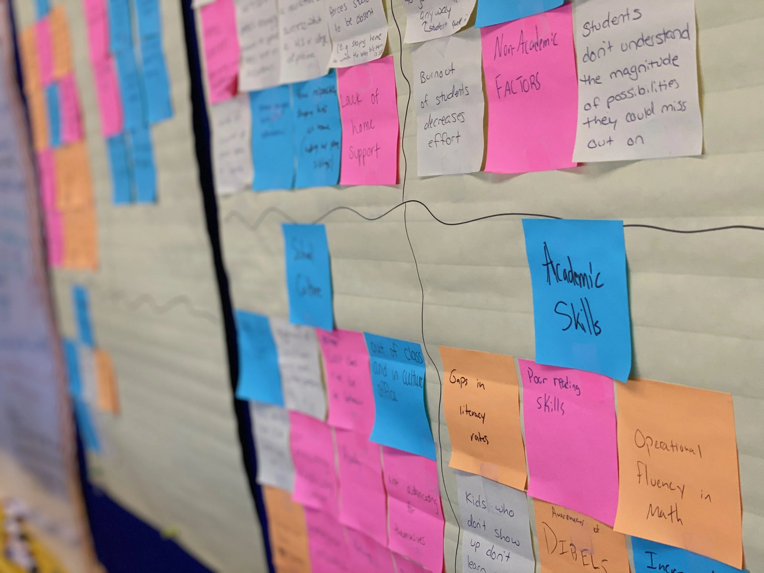
Next, volunteers share a single cause out loud, hand it to a recorder, and it is placed on the diagram. Other participants read aloud similar causes in order to create a cluster. This process repeats until all causes have been charted. A critical part of the sharing process is to rewrite causes that are outside of the school’s locus of control. We also place solutions into a parking lot to revisit later in the improvement project. Once all of the causes have been placed, each cluster is reviewed and named. Categories may be split if doing so clarifies how the system behind the problem functions. If a cause snuck through that is out of our control, we connect it to a school practice we can control.
The Fishbone Diagram is a living document that can be revised over time as the improvement team deepens their understanding of the systemic causes of a problem. It serves as the bridge between understanding a problem and developing a theory for how to improve the problem. Used correctly, the Fishbone Diagram is a simple but powerful tool that can be used by teams during the early stages of an improvement journey.
More on How We’re Learning to Improve
School Performance Institute serves as both the improvement advisor and project manager for School-Based Improvement Teams working to improve student outcomes. Through an intensive study of improvement science as well as through leading improvement science projects at the four schools that make up United Schools Network, we’ve gained significant experience with its tools and techniques.
We’re also opening our doors to share our improvement practices through our unique Study the Network workshops that take place throughout the school year. Our next workshop will take place at Columbus Collegiate Academy in Columbus, Ohio on March 17th.
John A. Dues is the Managing Director of School Performance Institute and the Chief Learning Officer for United Schools Network. The School Performance Institute is the learning and improvement arm of United Schools Network, an education nonprofit in Columbus, Ohio. Send feedback to jdues@unitedschoolsnetwork.org.